


BygdFokus is a consultancy that helps individuals and businesses develop projects in rural Norway. With deep local insight and strong networks, they bridge the gap between communities and industry to foster growth, create jobs, and improve quality of life in the districts.
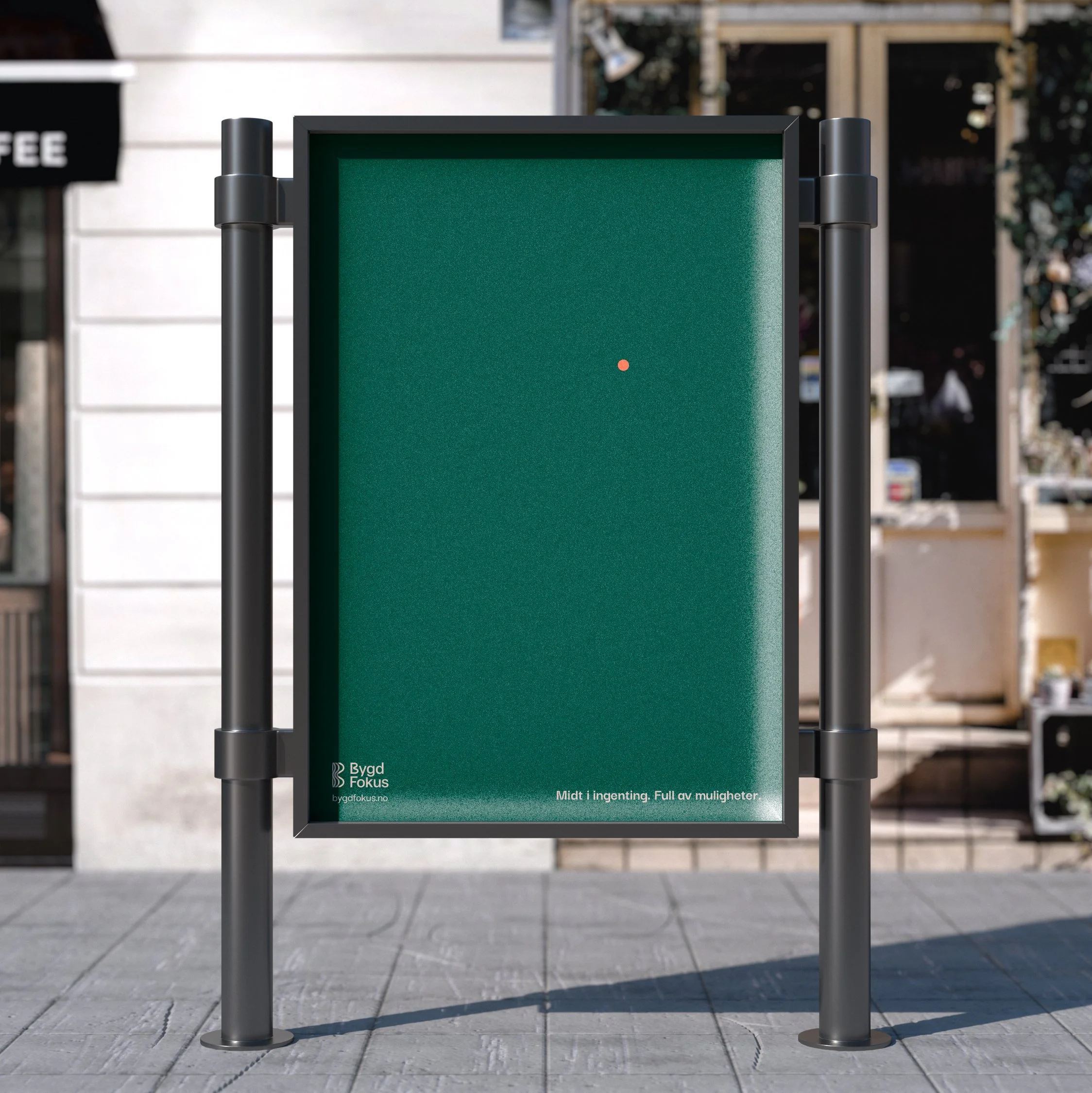
The logomark is inspired by contour maps, reflecting Norway’s rugged and varied landscapes. The flowing lines draw from the natural forms of mountains, waves, and coastlines, while the orange dot symbolizes the rural heart of the Bygd. Used across mediums in unexpected ways, it serves as a distinctive and memorable visual element—eye-catching yet unobtrusive.
As part of the brand package, a series of posters and flyers was created using actual contour maps of specific districts. These materials support local marketing efforts and emphasise BygdFokus’ deep understanding of the unique challenges facing each community.
Brand Identity